
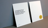
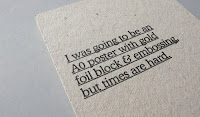
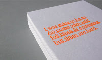
 A humorous take on the cost of printing things professionally from Because Studio. This was a self promotional print produced using a Gocco screen printing machine. Loz Ives has a lot of other cool prints on his website.
Labels: because studio, gocco, print
0 comments
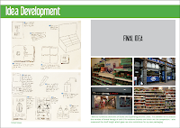
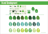
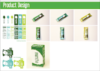
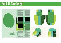
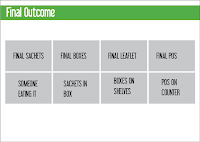 These are the mock up boards I presented in the final crit. They were quite rushed but got the basic story across. I got a lot of helpful input so I can improve them for the deadline. A lot of what my boards contain depends on my final outcomes so really I just need to get on with printing and photographing them. I basically need to condense things down a lot because some of the stuff I had included was just padding.
0 comments
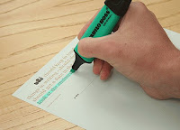
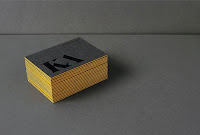
 Peter & Paul are a partnership based in Sheffield and they have some really gorgeous print work. That is all.
Labels: peter and paul, print
0 comments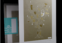
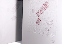 Every year, the design agency Office create a really nice Christmas card to send to their clients and friends. I especially like this year's golden owl one. It’s incredibly beautiful with a gold offset print, 2 colour gold foil and embossed details. It's weird how this Design For Print module has made me really appreciate print work like this.
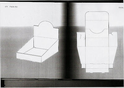
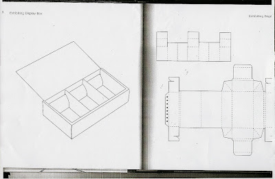
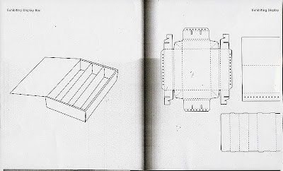
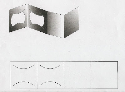
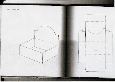 These are some of the nets for display boxes that I found in some books in the library. I mocked up a few of these to see which would work for my product and wouldn't be too difficult to make. I wanted something plain, that I could make my own by adding my brand identity to.
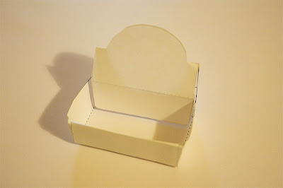
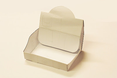 These were the best looking results from my mock ups. I have decided to go for the 2nd one with the sloping sides as this would allow you to view more of the sides of the product boxes.
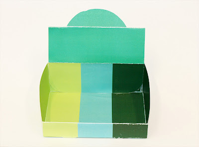
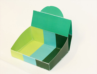 I tried a few colour ways and decided that I like this stripey design that would give you the positioning of the boxes in order of strength. When I did this, I got the light green and the dark green the wrong way round but its just a matter of fixing this in Illustrator and then I can add my identity.
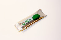
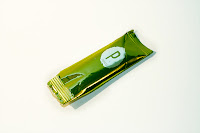 These are the two styles of sachet I showed in my crit today. Everyone seemed to prefer the coloured foils so I'm going to use this for my final design. As these would be printed using flexography this is the closest I can get to the final product.
0 comments
 I have been waiting to do this for practically a whole year now and today we finally got to do it - LETTERPRESS! We only got to do 7 prints of our name and blog address but it was so worth the wait. I loved every minute haha. I chose to use 18pt Clarendon Bold but due to the length of my blog address I had to use size 30 leading.
Labels: letterpress, print, typography
0 comments


 Can't believe I haven't uploaded these yet, whoops!
 A few months ago in the gym I saw some posters for lastminute.com and have been trying ever since to find out who designed them. At last I have discovered that Crushed are responsible. Crushed is a design agency based in Brighton and I really like pretty much everything in their portfolio. Looking through it has reminded me of things that I have seen and liked but never knew who did it before, like some of the packaging they did for Asda own brand biscuits and soup. I think I might just apply here for some work experience next summer...
Labels: crushed, graphic design, print
0 comments Genius! A billboard playing on the business card scene from the fantastic piece of cinema that is American Psycho.
Labels: billboards, print
0 comments

 Yesterday we had an induction at the Blenheim Walk print facility. Learning about the channels and their use in screenprinting was really helpful but otherwise I'd already had a good refresher at the end of last year when I screenprinted onto pillowcases and throws. We got to choose the colors and do two of of the channels for two different prints. We only had enough time to do so many prints so I was left with the yellow and brown one looking a bit shoddy. The green and yellow is cool though. I think I want to experiment with separating the colours channels and messing up the registration a bit more but maybe not for this project.
Labels: print
0 comments


 These are some beautiful prints done by Jason Munn who is the man behind The Small Stakes website. The site also has tons of other posters for some great American indie bands. A truly great printmaker, in my opinion.
Labels: colour, jason munn, print
0 comments This is a very nice Gocco duotone print by Magic Jelly. They have done lots of cutesy style prints which are available from here.
 These are the duotone black and red prints available from If You Could back in January. Each month they release 2 prints - one by an established designer and one by an up and coming.
 More duotone action from the designer Chris Thompson. It was produced to showcase the viscom graduates from Glasgow School Of Art back in 2007.
 THIS IS Studio are responsible for this greyscale poster on yellow stock. It is an offset litho print from an exhibition at Dazed and Confused. The show was to celebrate the 100th anniversary of Dr Duncan MacDougall’s claim that the human soul weighs 21 grams. The posters account the various reactions and triggers to 21 grams of forgotten matter from their studio floor: the inherent soul of the studio.
 CMYK - This CMYK girl was created by Miles Donovan, one of the co-founders of the Peepshow collective. The vivid use of stencils and spray paint on CMYK Girl is typical of Miles Donovan's simple yet evocative approach.
 RGB - This is a triptych by Melvin Galapon called Clarity. The embossed symbols within the busy striped print are a good exploration of line.
 Spot Colour - These business cards have been printed using a specially mixed metallic ink. I also love the embossed effect given by the use of letterpress.
 Greyscale - Guillermo Brotons is the designer behind this sheet of smiles. It depicts the mouths of the 48 students on his MA course and on the back are the languages that they can speak.