accident&emergency


Wednesday 31 October 2007
Font Clock

Font Clock is a 21st Century take on the British 24 hour clock design icon. Twelve different fonts are printed within the mechanism of the clock providing a random, mixed display of graphic language within a simple timepiece. It was created by Sebastian Wrong who had this to say about the piece:
The essence of the idea is the twelve fonts, all chosen for their design strength and individuality and all of which are twentieth century apart from one, an English 18th Century script. In theory, all given points within the annual time cycle, all the fonts will run together for 5 minutes.
----------------
Now playing: Sonic Youth - Sunday
via FoxyTunes

Labels: , , ,

0 comments
Tuesday 30 October 2007
Company


A very playful piece of typography by London-based designers Company. They have some other rather lovely designs on their website including this yearbook and poster.


I imagine that it is the bright colours and simple yet effective type that draws me to their work.

----------------
Now playing: Klaxons - Magick
via FoxyTunes

Labels: , ,

0 comments
Wednesday 24 October 2007
Daisy De Villeneuve


A few years ago I bought some shoes from Topshop and I just rediscovered these postcards that came with them. They are by the illustrator Daisy De Villeneuve. I like her simple linework, use of bright colours and the marks left by her felt tip pens. The simple typewriter style text works well with the drawings and the lined background makes it appear as if she just drew these in any old book.

I just realised that I've mainly posted illustration in here. I'm not sure why, I like illustration but its not really one of my strong points. Perhaps I should focus on design...

Anyway, I looked at her website and the design there is really nice. It has a nice home made feel to it, I think I like it because it reminds me of someones desk and when you click on each element it shows you more of her work, as if you were flicking through a sketchbook.

Labels: , ,

0 comments
Monday 22 October 2007
Stranger Than Fiction
Last night I watched a film called Stranger Than Fiction. It features a lot of narrative which is visually presented on top of the video. The information graphics were designed by an agency called MK12.

Labels: , ,

0 comments
Friday 19 October 2007
Foundation FMP
I just realised that I hadn't posted my final outcome for my final major project on my foundation course! Inspired by Subversive Cross Stitch, I used Image Maker to transfer images of celebrities onto aida fabric before cross stitching on some text. This would read as something that particular celebrity would never say. I had never done cross stitch before starting this project so I'm very proud of what I made. It's definitely become one of my interests for both it's aesthetic and relaxation values. I hope to do some more later on this year.

----------------
Now playing: Eminem - Role Model
via FoxyTunes

Labels: , ,

0 comments
Thursday 18 October 2007
Statements
What did you use to be?
A frustrated fine artist who designed websites in my spare time.

What are you now?
An eager graphic design student with a growing interest in type design and hand rendered graphics.

What do you want to be and how do you intend to do it?
A successful designer with my own agency.
Happy with my work with a clearly defined style.
In a position where money is no object.
I will achieve these through hard work and determination along with the skills I will learn from completing this course.

----------------
Now playing: Joy Division - Dead Souls
via FoxyTunes

Labels:

0 comments
Wednesday 17 October 2007
Video Interviews


A couple of video interviews with Kate Moross. I just find her work fascinating and I found that these give a good insight into the way she thinks and her working practice.

----------------
Now playing: Patrick Wolf - Augustine
via FoxyTunes

Labels: ,

0 comments
Tuesday 16 October 2007
Book Binding!
Today we made our books! It took ages but the finished product is so cool! The process:
  1. Fold each section in half.
  2. Make 2 slits an inch from the edges and then place the tags evenly between these making 4 more slits.
  3. Sew these together with the thread doubled up, making kettle knots after the 3rd section. Sew around the tags to keep the edge straight.
  4. Place in a vice and fill the cracks in the edge using PVA.
  5. Add two more layers of glue and then stick some binding fabric over them. Cover with more glue and then cut the tags to the size of the fabric.
  6. Cut out two doubled up rectangles out of paper, stick to front and back of book.
  7. Trim edges of book.
  8. Cut out two rectangles of grey board 3mm bigger than book on each side.
  9. Get cover fabric and draw out rectangles and spine onto it before gluing board down and folding into the correct shape. Cut the corners of the fabric at a 45 degree angle.
  10. Stick the coloured paper to the cover starting with the front and then moving the book so that you can stick down the back cover. DONE (as Gordon Ramsey says).
I chose purple for my front cover and burgundy for the colour paper insert. Heres how it turned out:


----------------
Now playing: Death Cab For Cutie - Title And Registration
via FoxyTunes

Labels: ,

0 comments
Monday 15 October 2007
Olofsdotter


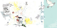
Linn Olofsdotter is a designer from Sweden. I like how she has kept a kind of visual diary on the front page of her website, in which she carries on an illustration and adds a new piece to it every two months or so. She has loads of other nice illustration and motion graphics work on her site. Haha pigeon barber! I bloody hate pigeons...

In other news, today we cut up our pages ready for book binding tomorrow! Yay it sounds fun, I love anything involving some kind of stitching. Then we did loads of colour theory which made me feel like I need glasses. I suppose its inevitable really, considering I spend so much time in front of the computer. After which we picked a primary and a secondary colour from the randomizer, I got red and purple. And we finished by coming up with loads of ideas for our A6 postcards about what we've learnt since being on the course.

----------------
Now playing: The Distillers - Hall Of Mirrors
via FoxyTunes

Labels: , ,

0 comments
Saturday 13 October 2007
Rob Ryan


Rob Ryan is an illustrator who not only does awesome screen prints but these 3 pieces were all cut out of paper! I admire his patience and the intricacy of his work. I liked doing screen printing last week a lot. When I get the chance, I'd like to do something a lot more precise and elaborate like these.

----------------
Now playing: Pink Grease - The Pink G.R.Ease
via FoxyTunes

Labels: , ,

0 comments
Friday 12 October 2007
First Post!
I thought I would just kick start my critical journal with the pieces that I found for the first PPD session.

Designer:


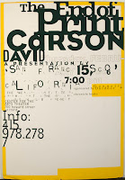
David Carson. I admire his magazine layouts as seen in his work on Raygun magazine in the early 90s. He is unafraid of being completely experimental in his approach. His covers for the magazine defined his signature style, using minimalist typography and experimental photography. The articles inside of Ray Gun often broke every rule of traditional design. The typography itself was far more interesting and interactive (in that you might have had to turn the page every which way just to read it) than that found in the majority of magazines on the market. I like how, as the art director of Ray Gun, Carson was unafraid to challenge conventions. He used overlapping blocks of print, dark text against dark backgrounds and photos that were deliberately upside down. He designs for designs sake, rather than legibility.

Typography:


Alan Fletcher. I was fortunate enough to visit his retrospective exhibition at the Design Museum last year and I found his work simply mind blowing. He has designed so many typefaces and being able to see how his working process had advanced over the years was quite special. I chose this piece purely for the variety displayed within it. Truthfully I could have picked anything from that exhibition. I'm particularly fond of his Reuters font.

Image:


Kate Moross. She is a London based designer who is still only in her third year at Camberwell but I really love her work. She has been commissioned for some big campaigns such as Cadbury's and has designed flyers for some great bands such as Les Incompetents (RIP!) and The Mystery Jets. She has even designed a line for Topshop. I chose her poster for Don't Panic because it really shows off her flair for mixing illustration, typography and geometric shapes. Plus it is completely hand rendered and coloured vibrantly with felt tip pens.

Photo:


David LaChapelle. I chose one of his photographs because I love how vibrant and surreal they are. Surrealism is something that I take great interest in. I found this great article on him in American Photo magazine.

"It's true that I was employing digital technology early on, because I had a grant from a Japanese company to test out their equipment," he says. "But in fact what we really do is build sets, paint backdrops, and all the images exist in real time. We don't do all that much in post-production."

His famous shot of a nude Lil'Kim covered in Louis Vuitton logos, for instance, required the diminutive rapper to be body painted. The driving vision springs more from an instinct for theater than from digital know-how. "I'm really not that interested in computers," LaChapelle says.

I find that fascinating. It is hard to believe that he can achieve such great work without much help from a computer. I could have chosen any one of his photos but I really like this portrait of Alicia Keys with her piano on fire. The fire is blazing and yet she seems completely unfazed. LaChapelle must really know how to communicate his ideas to his subjects. He has also directed numerous music videos, all of which feature his signature surrealism.

Packaging:

I really like the kitch style featured on Soap & Glory's packaging. They even ask the consumer to contribute to their designs by sending "postcards, vintage pictures or good puns". I think the typography placed onto black and white photos of scantily clad women reminds me of the posters for old B-movie horror films. But they have updated it for modern women by using a pretty colour scheme (pink, cream, silver, gold and black).

----------------
Now playing: Lil' Chris - Checkin' It Out
via FoxyTunes

Labels: , , , , , , , ,

0 comments