1. What skills have you developed through this module and how effectively do you think you have applied them?I have learned how to manage the colours of print work properly to ensure I can print the colours that I want. I have researched the potential of different colour modes and looked at contemporary practice using these to gain inspiration for my own designs. I now understand what each of the colour modes can do and how I can use these to further my future work. I used this work to create a set of 6 A3 spreads and think that I have applied the principles of what I have learned to these spreads in an effective way.
I also developed skills in different print processes including screen printing and letterpress - something I have wanted to do for absolutely ages. Unfortunately the direction that I took my 'good' project in, as well as a lack of time, meant that I did not include the use of these processes. I did however learn about lots of other types of printing, such as offset lithography, pad, gravure and flexography. These processes tend to be on the costly side and due to the facilities available at college, I only had access to CMYK printers. My work for the good project focused on the use of litho for my leaflets and boxes, and flexo for the production of my foil sachets. I could only mock-up on Photoshop what these sachets would look like. Despite not being able to actually use these two printing processes I feel that I have fully understood what is involved in printing with them, what they can be used for and how costly they can be.
I found learning about all the different parts of print processes to be really interesting. Things such as Pantone swatches, foil blocking, varnishes, embossing and stock are the really fun parts of printing. These are things that I can now consider using in the future to improve the quality and professional finish of my work.
2. What approaches to generating work and solutions to problems have you developed and how have they helped?Understanding how printing works has meant that I know more about the possibilities available to me when generating work which in turn means that my work no longer has to be limited to the CMYK inkjet printing that is so readily available within the college. I have done a good deal of research which helped me to develop my work and sometimes given me restrictions to help focus my ideas.
3. What strengths can you identify in your work and how have/will you capitalise on these?I can work well with colour which is something that many designers struggle with. I like to come up with a few designs and experiment with them fully by tweaking it slightly until I come up with the best outcome. This means that I find it easy to create thumbnail sheets of designs which are so vital to design. My production skills have improved greatly from what they were last year. When I get started on work I can produce designs at a rapid pace and this is an important skill in design practice. My primary and secondary research have been quite strong in this project and have heavily influenced the outcome of my project. I really enjoy research driven design and feel that I can respond well to it.
4. What weaknesses can you identify in your work and how could you exploit these more fully?I need to make sure that the finish of my work is complementary to my overarching concept. I felt that my packaging was a lot better than what I had produced in some of the projects we did last year yet I am just awful at hand rendering things. Perhaps I should stay away from packaging design in the future. I also felt that my idea development was sub par in this project. I found it really difficult to come up with something that could promote the health benefits of mint effectively and I think I just went for something that was obvious. Normally I feel that my ideas and concepts are the strongest parts of my work and I experiment more to get the maximum amount of development before creating a final outcome. But it just did not happen this time round. I think if I had time managed more between the good project and the colour project, this would have been rectified. This probably had a lot to do with the start of the year when I felt like we weren't doing anything when really I should have been working hard from the beginning. I also am not fond of long briefs such as this. I prefer to spend ages doing intricate research and then spending a short time actually solving a brief.
5. Identify five things that you will do different next time and what do you expect to gain from doing these?1. Create a time management plan at the start of the project to give me some idea of where I should be with a project at any given time as well as working harder from the beginning.
2. Experiment more with printing processes by actually using them and not just mocking up things using Photoshop.
3. Make sure I have enough time to make full use of the different printing facilities.
4. Develop my designs further to suit each element of a project, rather than sticking to one style.
5. Think harder about the concept and come up with something more innovative in order to create something better than just packaging.
6. How would you grade yourself on the following areas:Attendance - 5
Punctuality - 5
Motivation - 5
Commitment - 4
Quantity Of Work Produced - 3
Quality Of Work Produced - 3
Contribution To The Group - 3
Labels: ppd
0 comments
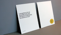
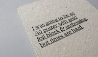
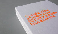
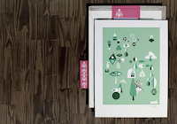
A humorous take on the cost of printing things professionally from
Because Studio. This was a self promotional print produced using a Gocco screen printing machine. Loz Ives has a lot of other cool prints on his website.
----------------
Now playing:
Patrick Wolf - Land's Endvia
FoxyTunesLabels: because studio, gocco, print
0 comments
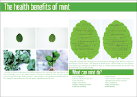
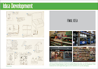
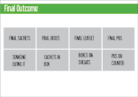
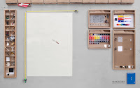
These are the mock up boards I presented in the final crit. They were quite rushed but got the basic story across. I got a lot of helpful input so I can improve them for the deadline. A lot of what my boards contain depends on my final outcomes so really I just need to get on with printing and photographing them. I basically need to condense things down a lot because some of the stuff I had included was just padding.
Labels: print, work
0 comments
 Peter & Paul
 are a partnership based in Sheffield and they have some really gorgeous print work. That is all.
Labels: peter and paul, print
0 comments
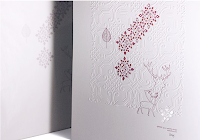
Every year, the design agency
Office create a really nice Christmas card to send to their clients and friends. I especially like this year's golden owl one. It’s incredibly beautiful with a gold offset print, 2 colour gold foil and embossed details. It's weird how this Design For Print module has made me really appreciate print work like this.
----------------
Now playing:
Queens Of The Stone Age - Like A Drugvia
FoxyTunesLabels: office, print
0 comments
I love this advert for the new Adobe Creative Suite 4. It was created by Bates141 Jakarta as a promotion of the new product at software-asli.com (some crappy site, I wouldn't bother visiting it). Theres some more pictures of the construction process
here. I can't wait for it to come out!
----------------
Now playing:
Claude Debussy - Clair De Lunevia
FoxyTunes
0 comments
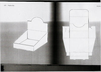
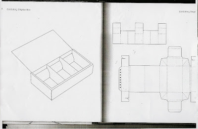
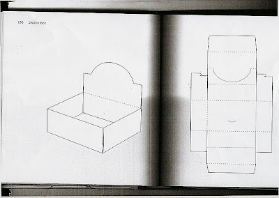
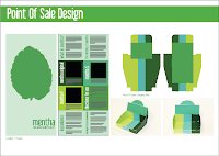
These are some of the nets for display boxes that I found in some books in the library. I mocked up a few of these to see which would work for my product and wouldn't be too difficult to make. I wanted something plain, that I could make my own by adding my brand identity to.
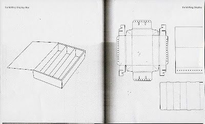
These were the best looking results from my mock ups. I have decided to go for the 2nd one with the sloping sides as this would allow you to view more of the sides of the product boxes.
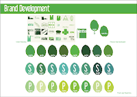
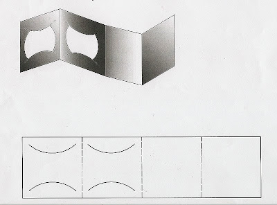
I tried a few colour ways and decided that I like this stripey design that would give you the positioning of the boxes in order of strength. When I did this, I got the light green and the dark green the wrong way round but its just a matter of fixing this in Illustrator and then I can add my identity.
----------------
Now playing:
Interpol - Stella Was A Diver And She Was Always Downvia
FoxyTunesLabels: print, work
0 comments
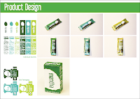
These are the two styles of sachet I showed in my crit today. Everyone seemed to prefer the coloured foils so I'm going to use this for my final design. As these would be printed using flexography this is the closest I can get to the final product.
Labels: print, work
0 comments
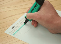
I have been waiting to do this for practically a whole year now and today we finally got to do it - LETTERPRESS! We only got to do 7 prints of our name and blog address but it was so worth the wait. I loved every minute haha. I chose to use 18pt Clarendon Bold but due to the length of my blog address I had to use size 30 leading.
A basic synopsis of how to use letterpress:
1. Choose your font, get a composing stick, add the correct length of leading and hold it in place using the anchor.
2. The bottom line is the top printed line. Work from left to right and then fill any extra space with quads, thicks and thins. The notch on each piece of movable type indicates the bottom of the letter so this should be facing upwards.
3. Add another layer of leading and do the next line. Use middles as spaces between words and use thins next to punctuation (except in web and email addresses). Add a final layer of leading.
4. Get a frame, work out where you want your text to be then fill top with furniture. Add your text and fill with more furniture. Put the screw ones at the ends to make it as tight as possible.
5. Use two bits of padding before the frame in the press, put the frame into the press and pack to the metal bar. Again use the screw furniture to make it tighter. Ink the plate by lifting the trip switch and roll over the plate. Put the trip switch back down.
6. Behind the sheet you want to print onto, place 3 sheets of newsprint and 1 of tissue paper. Put your foot on the pedal, feed the paper and release the pedal.
7. Turn the handle with one hand and guide the paper through with the other. Take out your print at the end and return the roller to the start.
8. When done use a cloth and white spirit to clean the type. Then use a dry cloth to dry them. Put back the frame and furniture and return the type to the box.
Neil also said we can change the ink. I really want to do some white ink prints on brown paper but I may buy some of my own movable type first, the selection at Vernon Street was really quite small and I want to do some massive prints. Looks like I'm going to be spending a lot of time down in the print room.
----------------
Now playing:
The Strokes - Is This Itvia
FoxyTunesLabels: letterpress, print, typography
0 comments


 A humorous take on the cost of printing things professionally from Because Studio. This was a self promotional print produced using a Gocco screen printing machine. Loz Ives has a lot of other cool prints on his website.


 These are the mock up boards I presented in the final crit. They were quite rushed but got the basic story across. I got a lot of helpful input so I can improve them for the deadline. A lot of what my boards contain depends on my final outcomes so really I just need to get on with printing and photographing them. I basically need to condense things down a lot because some of the stuff I had included was just padding.
0 comments
These are the mock up boards I presented in the final crit. They were quite rushed but got the basic story across. I got a lot of helpful input so I can improve them for the deadline. A lot of what my boards contain depends on my final outcomes so really I just need to get on with printing and photographing them. I basically need to condense things down a lot because some of the stuff I had included was just padding.
0 comments


 Peter & Paul are a partnership based in Sheffield and they have some really gorgeous print work. That is all.

 Every year, the design agency Office create a really nice Christmas card to send to their clients and friends. I especially like this year's golden owl one. It’s incredibly beautiful with a gold offset print, 2 colour gold foil and embossed details. It's weird how this Design For Print module has made me really appreciate print work like this.
 I love this advert for the new Adobe Creative Suite 4. It was created by Bates141 Jakarta as a promotion of the new product at software-asli.com (some crappy site, I wouldn't bother visiting it). Theres some more pictures of the construction process here. I can't wait for it to come out!


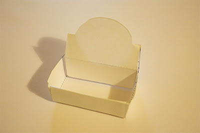
 These are some of the nets for display boxes that I found in some books in the library. I mocked up a few of these to see which would work for my product and wouldn't be too difficult to make. I wanted something plain, that I could make my own by adding my brand identity to.
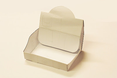
 These were the best looking results from my mock ups. I have decided to go for the 2nd one with the sloping sides as this would allow you to view more of the sides of the product boxes.
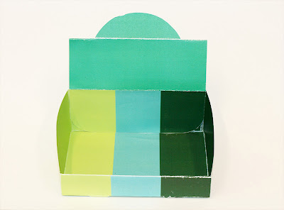
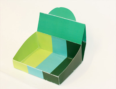
 I tried a few colour ways and decided that I like this stripey design that would give you the positioning of the boxes in order of strength. When I did this, I got the light green and the dark green the wrong way round but its just a matter of fixing this in Illustrator and then I can add my identity.
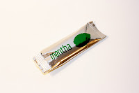
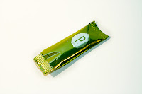
 These are the two styles of sachet I showed in my crit today. Everyone seemed to prefer the coloured foils so I'm going to use this for my final design. As these would be printed using flexography this is the closest I can get to the final product.
0 comments
These are the two styles of sachet I showed in my crit today. Everyone seemed to prefer the coloured foils so I'm going to use this for my final design. As these would be printed using flexography this is the closest I can get to the final product.
0 comments
 I have been waiting to do this for practically a whole year now and today we finally got to do it - LETTERPRESS! We only got to do 7 prints of our name and blog address but it was so worth the wait. I loved every minute haha. I chose to use 18pt Clarendon Bold but due to the length of my blog address I had to use size 30 leading.


 Can't believe I haven't uploaded these yet, whoops!