I thought I would just kick start my critical journal with the pieces that I found for the first PPD session.
Designer:


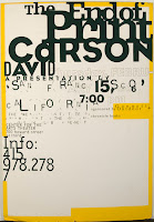
David Carson. I admire his magazine layouts as seen in his work on Raygun magazine in the early 90s. He is unafraid of being completely experimental in his approach. His covers for the magazine defined his signature style, using minimalist typography and experimental photography. The articles inside of Ray Gun often broke every rule of traditional design. The typography itself was far more interesting and interactive (in that you might have had to turn the page every which way just to read it) than that found in the majority of magazines on the market. I like how, as the art director of Ray Gun, Carson was unafraid to challenge conventions. He used overlapping blocks of print, dark text against dark backgrounds and photos that were deliberately upside down. He designs for designs sake, rather than legibility.
Typography:

Alan Fletcher. I was fortunate enough to visit his retrospective exhibition at the Design Museum last year and I found his work simply mind blowing. He has designed so many typefaces and being able to see how his working process had advanced over the years was quite special. I chose this piece purely for the variety displayed within it. Truthfully I could have picked anything from that exhibition. I'm particularly fond of his Reuters font.
Image:

Kate Moross. She is a London based designer who is still only in her third year at Camberwell but I really love her work. She has been commissioned for some big campaigns such as Cadbury's and has designed flyers for some great bands such as Les Incompetents (RIP!) and The Mystery Jets. She has even designed a line for Topshop. I chose her poster for Don't Panic because it really shows off her flair for mixing illustration, typography and geometric shapes. Plus it is completely hand rendered and coloured vibrantly with felt tip pens.
Photo:

David LaChapelle. I chose one of his photographs because I love how vibrant and surreal they are. Surrealism is something that I take great interest in. I found this great article on him in American Photo magazine.
"It's true that I was employing digital technology early on, because I had a grant from a Japanese company to test out their equipment," he says. "But in fact what we really do is build sets, paint backdrops, and all the images exist in real time. We don't do all that much in post-production."
His famous shot of a nude Lil'Kim covered in Louis Vuitton logos, for instance, required the diminutive rapper to be body painted. The driving vision springs more from an instinct for theater than from digital know-how. "I'm really not that interested in computers," LaChapelle says.
I find that fascinating. It is hard to believe that he can achieve such great work without much help from a computer. I could have chosen any one of his photos but I really like this portrait of Alicia Keys with her piano on fire. The fire is blazing and yet she seems completely unfazed. LaChapelle must really know how to communicate his ideas to his subjects. He has also directed numerous music videos, all of which feature his signature surrealism.
Packaging:


I really like the kitch style featured on Soap & Glory's packaging. They even ask the consumer to contribute to their designs by sending "postcards, vintage pictures or good puns". I think the typography placed onto black and white photos of scantily clad women reminds me of the posters for old B-movie horror films. But they have updated it for modern women by using a pretty colour scheme (pink, cream, silver, gold and black).
----------------
Now playing:
Lil' Chris - Checkin' It Outvia FoxyTunes 


 I really like the kitch style featured on Soap & Glory's packaging. They even ask the consumer to contribute to their designs by sending "postcards, vintage pictures or good puns". I think the typography placed onto black and white photos of scantily clad women reminds me of the posters for old B-movie horror films. But they have updated it for modern women by using a pretty colour scheme (pink, cream, silver, gold and black).