
 Two pieces by Dutch designer and photographer Anne De Vries. Both were completed last year and are called 'Game' and 'Eye Candy' respectively. I really love the wit of 'Game' and the use of colour and paint in 'Eye Candy', but its making me hungry...
Labels: anne de vries, photo
0 comments


 Etsy is a website where you can buy and sell anything that is handmade. A lot of people on there have recycled objects, paper and random junk to make some quite innovative books. The user Erinzam created these designs from cardboard packaging, a map and a cassette tape respectively.
Labels: book design, etsy
0 comments
 The Enlightenment is a lamp designed to look like a book by Dutch company Studiomeiboom. I like the way that they think and I think this is definitely something that challenges what is meant by a book. This is what they had to say about their product:
Labels: book design, product design, studiomeiboom
0 comments

 A very playful comparative study between feet and serifs by Belgian designer Maxime Delporte. He even has photos of feet wearing socks to highlight our own 'serifs'. Theres loads more interesting takes on typographic design at his website.
Labels: maxime delporte, typography
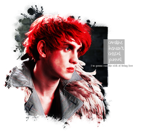
0 comments For Critical Studies I decided to look at Constructivism in response to the 2nd question "Choosing a particular period between 1800 to the present, in what ways has graphic design or design practice responded to the changing social and cultural forces of that period? Focus on two specific examples".
Labels: aleksandr rodchenko, constructivism, critical studies, exhibitions
1 comments

 A lovely little book by Liz Zanis called "Male Friends." The brown envelope is about 2 and a half inches wide and holds a silk-screened concertina book. It’s a very short story told in first person about a bike-riding postman’s son who throws love letters over the hedge to the narrator.
Labels: book design, illustration, liz zanis, paper engineering
0 comments
 These are some pictures of Damien Poulain's Colours Notebook.
Labels: book design, damien poulain, paper engineering
0 comments As I already mentioned I visited St. Ives for our current project last week. One day I visited the Tate and the Barbara Hepworth sculpture garden. It was cool reading the plaques with information about her life and how it mentions LCAD! The garden was pretty but I wasn't too keen on the actual sculptures. Much more exciting was the Tate gallery. Loads of boring fine art but there was an exhibit called 'Hugh Stoneman: Master Printer', which had loads of really cool prints. I'm really interested in photogravure now, thats definitely something I need to learn more about. I also really liked the wall pieces by Hamish Fulton. Some of the type in his work is really simple and gorgeous.
Labels: barbara hepworth, exhibitions, hamish fulton, hugh stoneman, typography
0 comments

 I went to St. Ives and Penzance for reading week. I collected scones, grease marks, grains of sand, tea stains and words I like the sound of.
Labels: 100
0 comments


Labels: infographics, work
0 comments

 This is Tim Fraser Brown's "reproduction of Édouard Manet's 'Bar At The Folies Bergere' made entirely of old Pantone chips. Over 5,000 unused chips were painstakingly colour matched and and stuck down over four long nights, and acted as centre piece for a boozey party in our design studio".
Labels: collage, pantone, tim fraser brown
0 comments